Sunday, February 24, 2013

ART 163: Modernism

Not to be confused with "Post-Modernism." This assignment focus' on a fairly 20th century interpretation of the term "Modern." It has to do with bold lines and patterns created by lights and shadows. I chose to do an interpretation of this sort of image by using many lines created by windows and shadows and electrical power lines.

As usual, I will start with the best few images, since that is under the project definition. 


 This one above is the most literal interpretation, at least from what I understood of the assignment, of the concepts of "Modernism." Strong lines created by an object and shadows and other things. As well, I feel that the dog footprints create some sense of movement through the frame. However, I don't like it at all. It doesn't speak to me whatsoever.

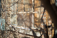
This next one I like quite a bit more. I love the depth of field that I was able to get around the window.
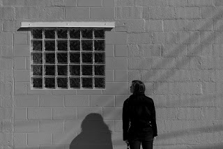


Speaking of simplicity, this one is even more simple than the last. While it is very grey in black and white, it was better than the boring cream color that the wall was painted. I'm not sure what I was going for in this frame, maybe a sense of intrigue as the viewer wonders what is in the window. I'm not sure.
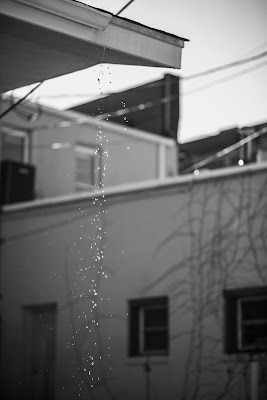


This final one was more of an experiment in the technical aspects of my camera. This was at ISO 1600, with a shutter speed of 1/4000, in order to capture the falling drops. But I feel that it could actually work for an assignment such as this, with the lines in the background.
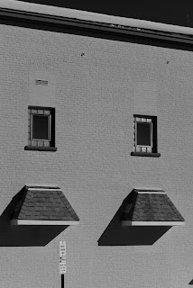
This one on the right is pretty much simplicity to the max. not much is going on, besides the double repeating pattern. But I like it in that aspect, and I feel it is very modernistic.


I also took a couple portraits that I found out could be considered "Modern"
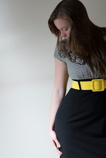
Some of the "Modernist" photographers had some pseudo-portraits looking more at lines and colors, as opposed to the traditional portraiture.


And now, of course, the obligatory image dump.


Thanks for watching. I'll probably have a couple more pictures on here before too long.

EDIT: More pictures!

 This one takes on an almost 3D look. I wonder what it would look like if I had taken it with a D800...


 The colors in this one are crazy-go-nuts. As well as the bokeh.
 
These shots almost look tilt-shifted to me, at least a little bit.
 Fake HDR for the win!

 This one is probably the most "bokehliscious" (to use the DigitalREV term) shot out of the bunch

After going through these pictures on my much larger, higher resolution Desktop monitors, I have come to the conclusion that I am absolutely in love with my new 85mm lens. The Depth of field is phenomenal, as well as the quality of the bokeh! I was using a 3 stop ND filter for most of these images, and the just turned out to me amazingly sharp, with a depth of field that isn't possible without an ND filter. Some of the images look almost unreal because of said depth. If any of you are looking for an awesome walkabout or portrait lens, I highly recommend an 85mm.


Preow,

Kevin

Sunday, February 17, 2013

ART 163: Surrealism Take 2

More pictures to add to the prior post, yet significantly different enough that it is they warrant a new post.

So tonight we went out to the Cemetery just across from the University (a lovely place for one, indeed) and did some more long exposure pictures.

Here are the 4 best pictures from tonight's outing:

 This was what I initially wanted to do, have a picture where the person was in the same place, yet their upper body was in a few different positions. Pretty cool.
 Now these two are very similar, so I sort of count them as the same one. I like the one on the left for the ghostly figures, but I absolutely love the one on the right, because that color swath is pretty awesome. For the assignment we aren't really supposed to do much modification that we can't do in our camera, so I don't really count it either...


And this last one also has that ghostly visage. It is a really interesting technique, yet I don't really feel like telling how to do it.


Now I don't really think that I am going to post a full 20, but maybe I'll have a couple more:


Anyways, that's it for this post. I might need to do a combined post where I combine the two night's photoshoots into one post so that I can find them for class tomorrow.

Anyways,

Preow.

Kevin

ART 163: Surrealism

Yet another assignment post. I promise that I'll get something meaningful at some point here.

Our next assignment was to do something surreal. Now I'm not really sure what that means, so I basically went out with my Girlfriend, Brother, and Brother's Girlfriend to do some light painting. I feel that it is something out of place within an ordinarily plain scene (such as a landscape, as you shall see).

Also, this is going to be another one of those maddeningly long posts with pictures everywhere that don't have any rhyme or reason to their placement.

First off, the 4 images that I think are the best:
 As seems to be my thing, I went back to the Indiana Dunes late at night. However, this time it was RIDICULOUSLY windy and cold, so I didn't stay out there for a super long time.
This shot is probably the most abstract of the lot, almost like Light Graffiti. I like it (and it's also my new cover photo on el facebook)

 This one I also really like. Something about spinning and movement around a stationary object in a forest conjures up, to me, images from mythology about Will-o-Whisps that would lure unwary travelers to their demise. I love how the green vapor showed up in this one too, from the green glowstick.

I went to Target today to get Ice Cream (oddly enough) and ended up with Glowsticks.


 This next shot is another one that I am not too sure about, though I really like the light pattern created on the road, and the sense of movement from my brother, who is the one spinning around.
 This one above here is probably the most surreal, in that there is someone standing there, yet there is the odd colors flying by, and there is the subtle shadow cast by me. Now you have to realize that when I was framing the picture I couldn't see that shadow whatsoever, and it was only through my Camera at ISO 1600 with a 20 second exposure that I was even able to see it. Eerie.

This one is probably one of my favorites, after the first one featured. I really like the sky offset by the beach and the fractal form.

Anyways, now here is a huge image dump...


I'm sure that I could have something to say about all of these pictures, but I don;t really feel like it at the moment, as it is 2:20 am and I really should go to bed.


These last two pictures are just setting up pictures before doing anything. Look, Stars!

Now I'm going to bed,

Kevin